The informal case study
Part 3 — Lookup
I never felt much fascinated in any form of travel until I encountered some sort of highly engaging relatable examples on the way. To travel more there must be some push that is intuitive and highly relatable with our daily life. Thus I do research and relate the content with my learnings to get the momentum clear. Thus let me shower some relatable examples of popular business sites experimenting how better or average they offer user experience (to my understanding and experiences — however, I gathered feedback from others too ensuring quality sharing).
In case you missed my earlier stories on understanding why UX is for everyone and how you can utilize it for the web, please do read them and get back. This would make much sense then.
Part 1 — UX — everyone’s responsibility
I will be sharing a few screenshots which you can relate to if you have read my earlier stories. This is just a continuation of it or the practical part of it. The websites I have chosen here and views shared are purely based on my interest and feedbacks from my mentors and friends. I am not promoting any business or not a part of these concerns in any form.
Let me start with the medium itself. There couldn’t be a better website to name if someone asks me as proof for good UI/UX values. The first thing that attracts me the way they use the content placeholders. When it comes to content sharing platforms like the medium it is essential to deal with high-quality images, graphics and page load time as a whole. Imagine yourself presenting your content on the medium your priorities would be delivering rich user experience via high-quality images and motion graphics. But being a reader what you will be concerned about is the load time. Remember the 5 seconds test which I have talked about earlier. Medium tackles this issue elegantly with the help of content placeholders.

Have a look at the way these placeholders are presented. They replace the void and offer a feeling of engagement with the content.
Secondly, I love the login screen setup. I hope you remember the strategy of simple design and pain in filling forms. Medium’s way of solving this looks amazing and intuitive.
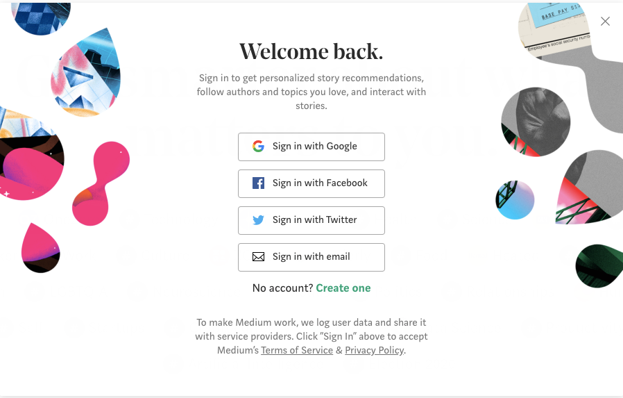
Why would someone refuse to use these kinds of easy sign-in options? I do mostly prefer Sign in with Google option since I am too bad at remembering long passwords. Recently one of my relatives approached me to help him with the recovery of his iCloud mail(Apple mail) account. He was too much worried since he hasn’t changed his password since the time of the account setup and somehow got signed out now. He was struggling to recover his account again. I can see the frustration and pressure he was experiencing being a sales professional unable to answer to his business mail at his own comfort. I helped him and now he got his account back. But the sad truth is the majority of apple product users are not that educated to use their products. I didn’t mean that Apple failed to satisfy its customers with good UX aspects. Of course, Apple is a pioneer in that, but what I mean is these kinds of encouraging users to use options like single sign-on or scanning barcode or OTP login makes our life much easier. And by the way, Apple provides one of these or more but he was not practiced to those earlier.
Sorry to deviate but I couldn’t restrict myself by mentioning this here. Major giants like Zoho, Google offer a single sign-up facility which makes our life super simple. We can sign-in with an account to access all the apps bound with them like Gmail, Calendar, Youtube, etc when it comes to Google. And Zoho offers the same kind of flexibility for 40+apps.
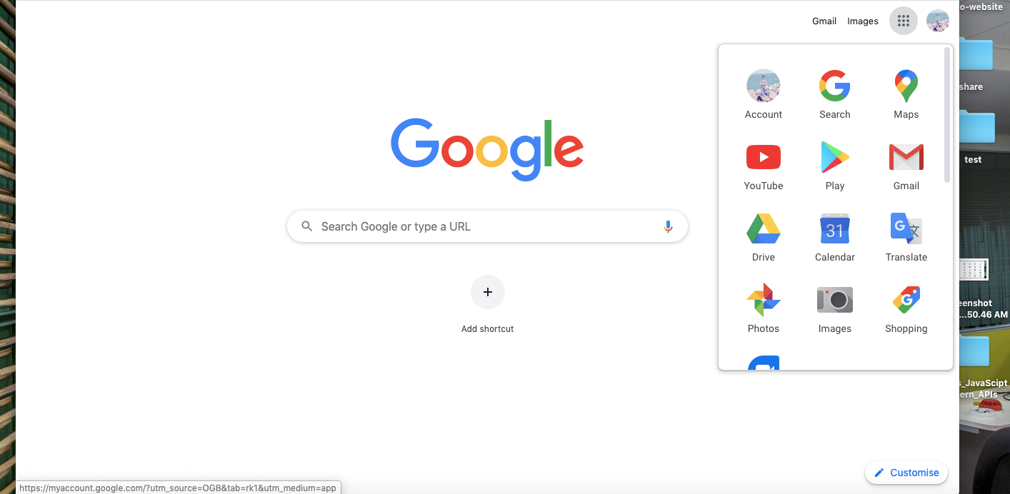
The amount of content that medium like sites offers is huge. If you think of presenting those content via navbar or menu kind of setup it would become more complicated with lots of submenus or levels. Thus an effective search feature would help us in this case. Medium makes use of this effectively.

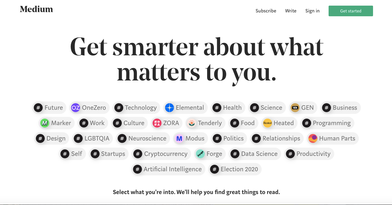
The homepage is something a new user encounter to see in most cases. When it is concerned with presenting a list of features or types of content offered it becomes extremely sensitive to deliver in the right way. In that case, I hope the medium does it well with their tags kind of categorization on the home page. Users would love selecting the kind of content they need and then signing up with the service to access those. This reminds me of the rule that before asking for any information convince the customer with the kind of services you offer and gain their trust.
We have earlier discussed the importance of using simple as well as consistent design. One site I love watching repeatedly for their consistency and simple nature is Freshworks. The way they provide the category pages, product pages, blogs, navigation is simply awesome. I will leave you a few of my favorites below.
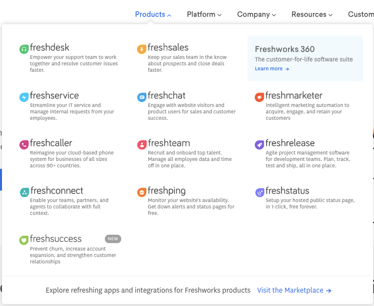
See the way the navigation is provided with proper description, image and note how spacious they are aligned enabling the user to compare and pick the right one for them.
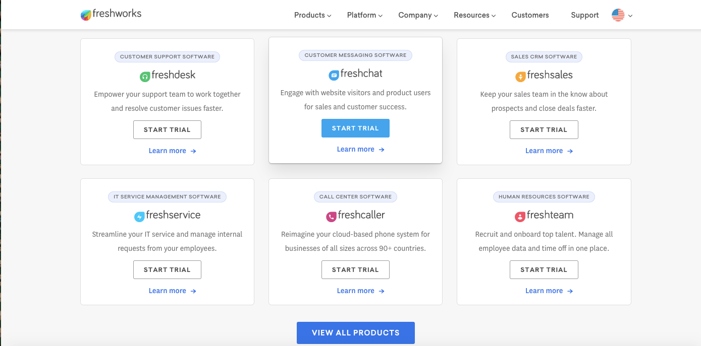
This is the category page of the Freshworks website. How accessible and informative it is, right? Eye-catching call to actions, short informative 2 line descriptions,product-specific tag at the top and a way to know more about the product if the users wish to proceed with those. This is what we would expect from a business standpoint.
And this one from Zoho stands its own way of categorizing products. Not much content clogged and stays self-descriptive.

And this one below from Dunzo stands out with the UI and clarity with content offered. The catchy call to action is my favorite among all.

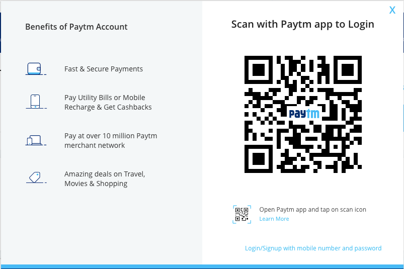
I hope you remember the example of break vs accelerator highlighted in size and color as a context in order to deal with an emergency. In the same way, we would be in a situation to highlight certain features or indirectly impose certain behavior to the users. One such thing is forcing users to prefer using app kind of interface for their services. You can find this kind of promotion in Swiggy, Zomato, Uber, Ola, Paytm, etc.
See the way login screen is offered by Paytm enabling them to scan using a barcode on the app and notice the way less importance is given to the other option of classic sign-in method. (You can find it with light-weighted font at the bottom)
When it comes to using relevant and engaging image content Byjus is my favorite. Their images would be self-explanatory, attractive and not overwhelmed personalized for small kids.

I should also wish to point out some of my bad experiences with popular sites to make justice to my research at this point in learning.
The very first thing that frustrates me a bit is the SBI online banking site. I can understand they wouldn’t have a proper standard dedicated development team for UI/UX. However, I appreciate their work in solving one of the most complex problem of handling payments or transactions.No doubt they are quite awesome with the service they offer. But a small focus in understanding user experiences would greatly hike their business model and people would love to spend time on their site.
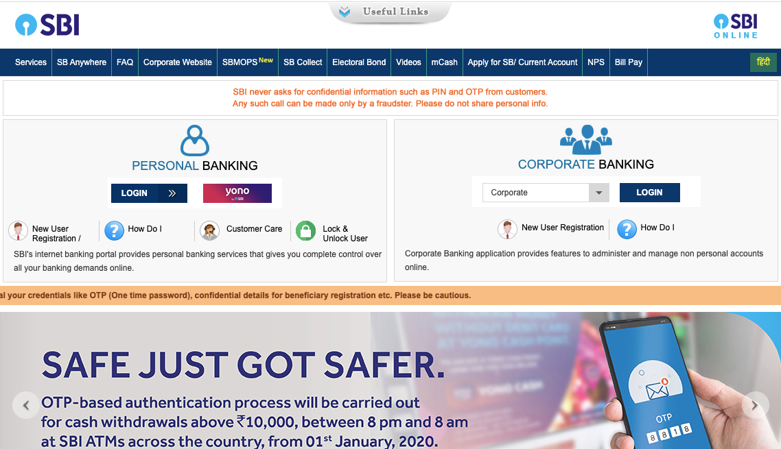
Just look at the interface above. Did you find any difference in the images and call to action provided over there. Call to action should stand out in a UI to catch user attention. There is a lot more we can list out. But this is one basic and an essential thing worth mentioning.
Next in this category worth mentioning is the official IRCTC railway site.
We have seen that understanding the user and their behavior is the primary requirement to deliver the right content earlier. Why would someone visiting the IRCTC site look for Zee5 channel subscription and I wonder is it that important to provide it in primary nav?
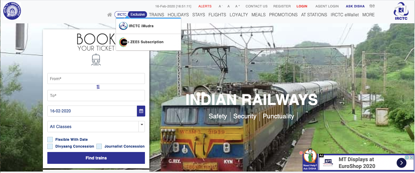
Similar to the call to action navigation too should stand out in some way accessible to the users. In the above image, you can note the navigation to be congested without much categorization and choosing one content on others would definitely get disturbed. This no way will delight the user.
One more thing that caught my attention is the one with the Paytm site. Although it’s pretty decent I would expect Paytm to offer much more elegant UI for navigation.
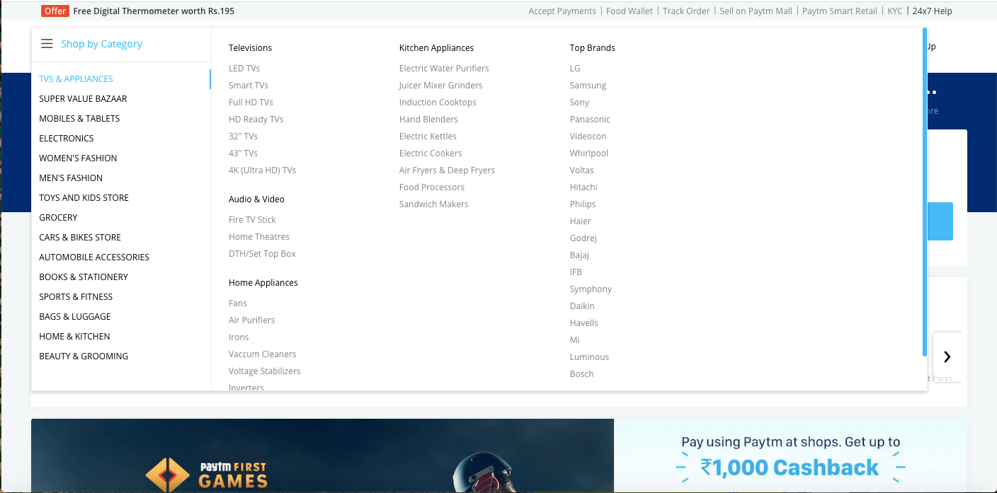
I hope you remember my earlier points on adverts and content. Does it make any sense to show beauty product advertisements in an educational content sharing site like geeks for geeks?

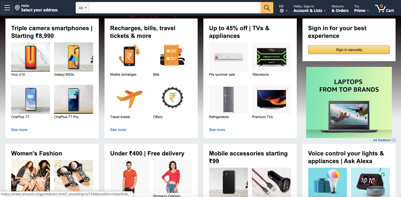
And this one is related to clickables. I wish Amazon could make this experience with clickables better with some way of light shadow animation or separations like the one we saw with Freshworks and Zoho sites above.
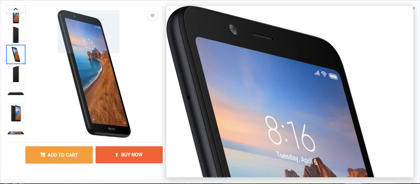
Images play a vital role when it comes to product selling sites like Amazon, Flipkart, etc. Users should get lively when touching the products in person since nothing can replace that feeling.
Apart from this, I love the way Linkedin, Google, and Apple delight their customers with their UX strategies.
I hope you enjoyed this post and you would have many such opinions and experiences like these which I would love to know from you in my inbox. You can reach me at mariappangameo@gmail.com.
...
Personal blog of Mariappan S. I’m a Web engineer working with React, Vue, GraphQL and Node. Happy engineer turned a happier writer! I am fond of tech, irrevocably in love with teaching it!
Feel free to connect with me on Linkedin or contact me at +91 8072343371