UX for web
Part 2 — Drilling deep to the parts
I do believe you can learn much faster if you successfully convinced your mind to learn. Want to know how? Please do read the first part of the post in case if you have missed it.
Earlier in the first part, we discussed why should one get a grasp of UX irrespective of our role in an organization. Now let’s understand how UX plays when it comes to web interfaces and experiences.
Consider any website that you the most in your daily basis. It could be Cricbuzz (if you are a cricket fan), learning portals such as Udemy, Coursera if you love hunting skills or just a movie/music streaming site such as Youtube and Netflix. What compromises you to spend time on those sites?
Useful and targeted content delivered in the right way. What that means is the one which tailored with delightful user experience in a nutshell.
Earlier I was given a chance to work as a UI engineer contributing majorly to the company’s website aligned purely from a marketing perspective. There will be changes every day and new pages get added up most of the days tailoring the marketing needs. Only then I understood what vital role a website plays for a company’s marketing success. They run personalized campaigns tailored for targeted customers and delight them with awesome website experiences. I was working for a long without true knowledge about these facts. But then I learned how important it is and would love to share it with you as well.
Let us find answers to common usability questions in the upcoming section.
What makes a good user experience?
Building a site for your visitors
It is necessary to know who our audience is and understand how they behave in order to build a successful website. For example, consider a vehicle booking site what information would your customer expect from you? Incase if your customer is in need of a car for his/her personal use he would probably interested in the color, model/brand, design, and price. Likewise, if the customer is expecting to buy one for his business need, let say he is a logistics agent traveling more to deliver goods. What he would expect is gas/fuel efficiency, capacity or space rather than look and feel. Thus it’s our responsibility to present the right user with the right needs at the right time. This is possible only if we have a basic understanding of who our audience is and what they expect from us.

This is something to be sometime referred to as persona. It includes attributes, values, goals, and concerns.
Understanding how users browse the web
It’s vital to understand how your information will reach the customers. Research states that about 88% of the content is accessed via a search and only 11% is accessed via direct links or other forms of shares.
It is unlikely that only users will see the homepage of your site upfront on all searches. Search engines may drive the user different parts of the site based on how relevant the content is relating to the search keywords. Thus it is essential to include some basic information to clearly show what the site is about in all pages of the website. It can be made possible with the help of definitive tagline, logo or some images.
What causes users to stay on a site?
Information — yes that’s what users most likely interested with
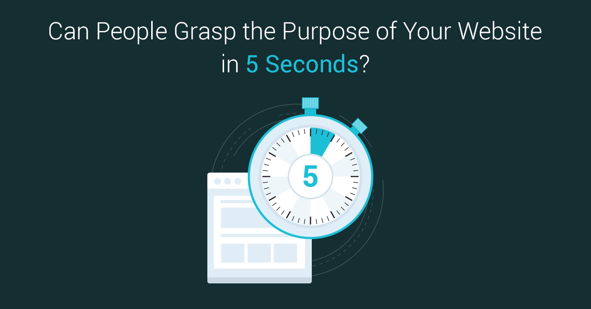
If you could satisfy users with some basic information at the very beginning in the form of a short description, relevant image or a definitive tagline you win the play. Why is it so?
Users are more likely to spend <5 seconds on judging your site if it’s relevant to their search or not. Normally professionals test their site using the five seconds test strategy, which means we should get answers to questions like What the site is about? What else he noticed? Did you decide on going further etc by allowing him to see the site preview for 5 seconds only? Interesting right, but believe me the thing one gets on that 5 seconds is what decides your content views.
What causes users to leave a site?
Of course bad user experience — what that refers?
- Hinderance of information — if you cannot satisfy the visitor with the right information in his first 5 seconds of visit you end up losing them.
- Using technical jargon — you shouldn’t expect every visitor to be relatable to your work, there could be a person from the purchasing department looking out your site who will have no idea of your technical jargon.
- Confusing users with flattering information.
What are some common design strategies followed and why you should consider using them?
Simple design
Simple design doesn’t mean that the site should be boring.
If a single entity doesn’t make any sense to the site’s purpose it is worth to be removed. This is what we mean by simple design. We should make sure each image is relevant and add value to the content. Advertisements should be relevant. There is no meaning in having a happy smile, long welcome message notifying the user with their timezone, weather, etc in an e-commerce homepage. This is what simple design is focused on.
Consistent design
Consistency pays off
- Having the same response whenever performing an action in our site
- Using standard design— use the same elements as the major sites do and avoid fancy stuff. You may ask me why?
I hope you remember the end of my previous post where I talked about using date pickers and fancy animations. The reason why you should avoid those are classic elements are supported by most browsers and *users are familiar *with those elements already. Cross-browser compatibility is a major concern to be considered when developing any website.
Try to innovate with your content and not by innovating the container of your content.
Now let’s talk about different parts of the website.
- Navigation
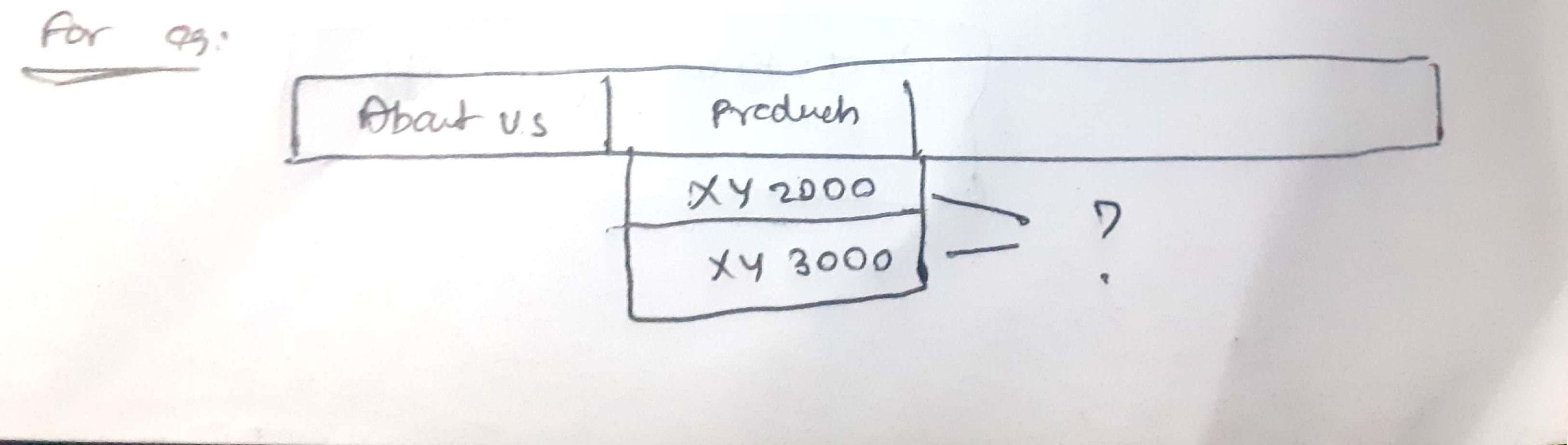
- When it comes to navigation the important thing is the navigation text should be simple rather than some industrial jargon.
- ie. In the above image, it’s more unlikely for the user to know what XY2000 and XY3000 means.
- It should enable users to understand that they are on the right site with its options as an overview of the site’s content.
- It could be task-based (verbs)— save, update, create, etc or category based(nouns) — wedding, birthday party, etc or user-based — user, small business, enterprise, etc.
Sometimes users get frustrated when you use
- Badly coded menus
- Confusing menus
It’s good to follow the 7 plus or minus rule for menus — which implies not adding more than 7 items.
2. Links — it is advisable to use the same underlined blue color combo for links as users are more likely to identify them.
3. Clickables - in case of clickable always make sure you add them to the right component and guidance notifying it’s clickable. A hand symbol on hover would make little sense.
4. Homepage - this is the page users are more likely to encounter. Changing the contents on the homepage is a way to keep visitors engaged and refreshed. Believe me, I have been working with a startup’s website in which we made changes to the homepage twice in a period of 20 days. That too in an enterprise site.
5. Category page - it should correspond to navigating menu items. One quick tip is to keep a comparison in mind and design the right way.
A landing page is a kind of category page but specifically designed for targeted campaigns.
6. Detail pages — Give a detailed description of the content. In the case of e-commerce, elements make sure to include a call to action.
7. Images— Like we saw earlier make sure that the images are more relevant to the content. Also consider using multiple angles, zoomable content,3D viewing and videos for better experiences.
-
In case of media avoid using auto-play as it could be annoying at certain places say an office or a public place.
Use graphics for an explanation, not decoration
8. Forms — Filling in forms is not normally people’s enjoyable activity. Thus we should make it as painless as possible. Remember only one thing.
Ask only for relevant information that too at the right time or interaction

- Try using variable lengths for input fields confining to its length which would make much sense to the user.
- Effectively guiding the user through the form filling process with explanatory error messages is one key thing to be considered.
- Avoid using a reset button as it could be painful for the users if they unknowingly clicked it or at least differentiate them as if it gets less importance compared to the submit button.
- Before asking for any sensitive personal information from the user make sure you provide the trust via your quality content and more detailed information on what purpose you ask for that information. This is known as permission marketing.
Adverts on web
Imagine yourself presented with ads related to cosmetics on viewing an informational site like Wikipedia. Users could feel highly uncomfortable and might leave the site. Thus show only relevant ads that too without distracting the users from the main content.
Now you know why UX is important for all and how to delight customers with the right user experience on the web. Let’s have some controversial fun with some top websites with their UX strategies, plus and failures to my knowledge in the next part. Also, do remember the above contents so that you can relate to the following story easily.
Write to me - mariappangameo@gmail.com
In case you missed to read part 1 — please do read now.
Next story, Part 3 — The informal case study
...

Personal blog of Mariappan S. I’m a Web engineer working with React, Vue, GraphQL and Node. Happy engineer turned a happier writer! I am fond of tech, irrevocably in love with teaching it!
Feel free to connect with me on Linkedin or contact me at +91 8072343371