UX — everyone’s responsibility
Part 1 — Warming up
Delivering delightful user experience is everybody’s responsibility. In other words, great UX is everybody’s business.How do I arrive at this confession? Let me make it clear. Let’s say a car, could be your brand new Rolls-Royce, Benz or classic Hyundai i20.There are a break and an accelerator for sure right? Let me add some taste with an image to help us.

Note the size of the break is quite larger compared to the accelerator available near to it?
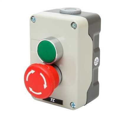
Now let’s look at one more example for better understanding. Consider the below image of the on-off type machinery switch.
Why is the size of the turn-off switch is big compared to the other and notice the bright red color preferred for an off switch?
In both cases, we tend to use them in a hurry in most cases and thus the added importance. Consider a situation you are riding your favorite car relatively at a faster pace and suddenly a small child crosses you to pick his/her ball. What will be your immediate action? You will reach out to the break right? And imagine how horrible it would be if you accidentally pressed on the accelerator instead of the break. Nothing is worse than that I hope. Similarly, if you are in an industry and say there is a fire outbreak. You are supposed to turn off all the machinery in a hurry and thus it should be approachable at ease.
This is known as Fitts’s law — Its faster to hit larger targets closer to you than smaller target farther from you.
Now let me ask you something. Will it be an added advantage if the car and switch(machinery) manufacturers/designers have a basic understanding of UX and implement them in such a way it delights customers? If so, there is some relationship between those parties and UX I hope.
Each of us has different views on design, color, interactions, content, and accessibility. I do think each of us capable of contributing to craft our own experiences with the product. It could be via feedbacks/reviews or anything that could help us evaluate our experiences and relationship with those experiences.
Now let’s narrow down to the IT industry.
User experience has very little in dealing with visualization
There are some other key aspects that can be contributed by varied profiles of IT namely helping with user research, content, accessibility reviews, some tweaks on data analysis (on user behavior) and so on.
For example, a data analyst could analyze huge volumes of data. But are they relevant, do those serve the purpose of research, are those what the customers are really interested in. How does the analyst get to know all these? They need to do some research on user behavior before rolling up. In such a case, UX is for the data analyst as well. This can be the same for various other profiles from ML to content, marketing and sales. All should possess some taste of UX aligning with that of the user.
Now let’s dive deep into issues that we could face if there is a gap in getting the UX right. I will try to share my own experiences and those I came across in industries I have been before as an intern.
I have been getting trained as a frontend engineer or similar profile at most placed I interned with. Thus major work will be inclined with developing user interfaces and enhancing the performance. Irrespective of the tech stacks have learned a lot regarding usability and performance. Let me share a few experiences, how we arrived at a feasible solution, kind of help I got from my peers for better understanding.
I was that kind of KG guy who thinks if we arrive at a working solution on the screen my job was done. But it took me no time to understand I am wrong completely. I should arrive at a feasible, workable and usable solution in all cases when it comes to the industry. One task was to develop a language switching feature for a company’s website. The problem statement goes like this.
Design a language switching dropdown at the navbar with the default value set based upon the user’s locality. The dropdown shouldn’t occupy much space but at the same time usable without much effort.
I used some kind of API and got the job done fetching the locality. I just checked the developer’s way of testing (imposing our own flow without considering the knowledge of the end-users). I submitted it for the review to my mentor. But guess what the feature was reported with tons of usability issues namely the dropdown values should toggle once clicked outside somewhere else on the screen, value text should be aligned evenly irrespective of their length and screen sizes, etc. It took me just 2 hrs to code the logic but we were working with those usability issues for almost 3 days. The reason for the delay is my way of understanding my role. If I have convinced my mind that UX is for everyone I would have thought of those usability factors during my development. I could have learned about possible solutions during my learning face and thus there wouldn’t be such a long delay challenging my reputation.
The same way I paved the way to several other difficulties lacking basic understanding about the users. I forgot to check the layout’s responsiveness for my development works. It’s not the case all users would view those sites on a large screen say laptop or pc. They may view at different screen sizes and resolutions. Some prefer tablet type pc, most prefer mobile screens. And to my surprise, I was using the MacBook air 12-inch screen for development and guess what it also created some deviations in alignments and placement.
In the beginning, I was a bit frustrated but later when I started approaching them with some knowledge on UX it was a kind of ride for me(challenging but fruitful at the end).

Earlier when I was working with several personal projects I used to try out the latest web elements like date pickers, fancy animations and a lot more. At one stage I started to wonder why no big giants and commercial startups using those on their websites? Are they not aware of its existence? Or are their engineers not capable of implementing those? I don’t think so. There is some other reason for this which I would cover in my next part.
Without your users you are nothing
I hope you made your mind to experiment UX and learn user behavior. If so please do follow up with later parts as well.
Next story Part 2 — UX for web
...
Personal blog of Mariappan S. I’m a Web engineer working with React, Vue, GraphQL and Node. Happy engineer turned a happier writer! I am fond of tech, irrevocably in love with teaching it!
Feel free to connect with me on Linkedin or contact me at +91 8072343371
